Back in Black – The Electriq Power Rebrand
Published by on April 25, 2019
After 3 years with our former logo and brand, we decided it was time to part ways with our debut identity. And while it served us well in our early years, the old mark simply didn’t represent our new progress, enhanced capabilities and rapid growth. It was time to rebrand Electriq Power.
Eager to differentiate ourselves from other big players in the market, we set out to design an identity that was clear, unique, and meaningful. Deep introspection and countless iterations led us to a new logo and visual identity that we feel reinforces our traits as an energy storage company and distinguishes us in the industry.
Read on to see more of the new brand and learn why certain design decisions were made.
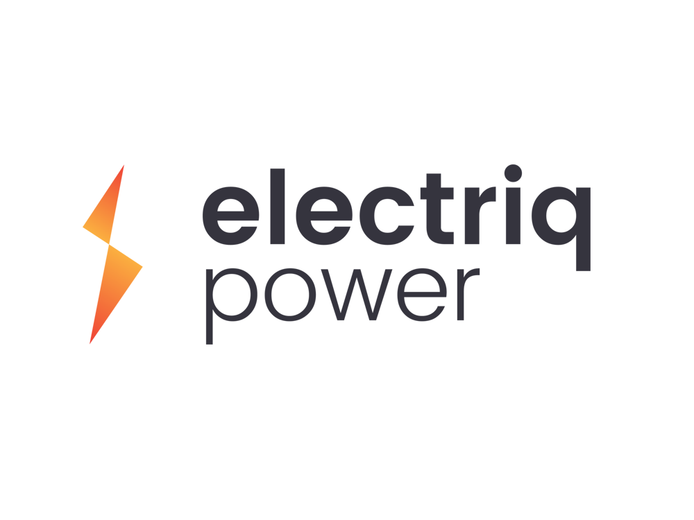
THE LOGO
One of the pain points of our former logo was its contribution to the mispronunciation of our name. In an effort to make our name more clear, we removed the emphasis on the ending two letters of “Electriq,” so our customers can read and pronounce it simply “ee-lek-trik.”

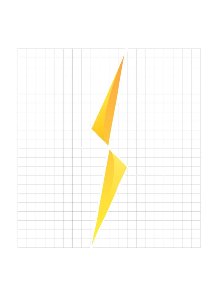
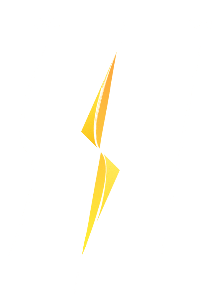
THE BOLT
Our former logo mark carried little meaning and wasn’t quickly understandable at a glance, so when designing our new mark, we wanted a symbol that made sense to our industry, but was distinct and meaningful in its form. The result: a fierce, symmetrical lightning bolt with vibrance, flow, and dimension.
While a lightning bolt generally stands as the iconic symbol for electricity, our interpretation of the familiar mark was crafted with careful intent to convey multiple layers of meaning. Here’s a little breakdown…
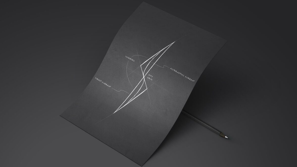
INVERTED
An integral part of our battery system is the inverter apparatus which converts direct current electricity into alternating current.
Using inversion as a visual tool, our bolt design has two symmetrical shanks which are simply an inverted replication of the other.


THE PAINT JOB
Our yellow to orange gradient is meant to convey growth and flow, while simultaneously invoking a sense of powering up.
OFF GRID
One of the many benefits of our energy storage system is that it allows users to go “off grid” and be energy independent. It was important that our logo represent this visually, so we made sure no angle or edge of the bolt correlates with a grid pattern.
AC/DC
The curving depression that sweeps along each shank of the bolt, as well as the straight spine that stretches from one tip of the bolt to the other is a nod to the two electrical currents: AC and DC (not the band). The alternating current is represented by the wavy form, and the direct current is represented by the straight line.
It is our hope that customers will see our new identity and not only recognize it as Electriq Power, but also appreciate the craftsmanship and meaning behind it all. We take pride in all that we do, and this rebrand is proof of that sentiment.
Please visit our new website and learn all about our smart home battery solutions, and to reach out with any questions.